YA Fantasy Cover Art Selling Books & Telling Us About the World We Live In

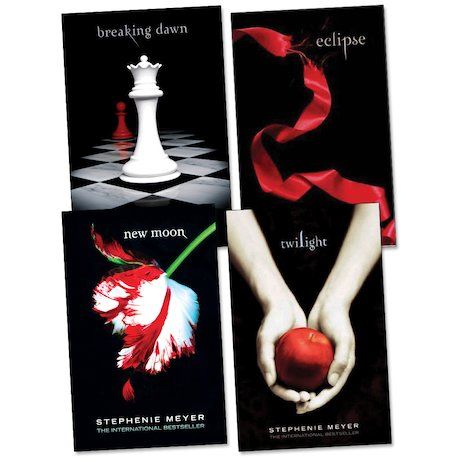
For Christmas my daughter received a book of the month subscription from her grandmother. As the books have arrived I have been interested to see the cover art. While we say "Don't judge a book by it's cover" we always do. Cover art is a huge factor when choosing a book to read. Many publishers will play on the success of other titles when creating cover art. Think back to the mid 2000's. You couldn't find a Young Adult cover that didn't have the Twilight Sage's signature black background and gothic script.

About that time I picked up a copy of Cinder - the first book in the Lunar Chronicles. In the original cover art you see a cyborg foot in a striking red stiletto against a black background with the title in gothic font. With the rise in popularity of graphic novels the series got a new look in 2020. The new covers aimed at capturing the attention of current young adult readers. It also opened the door for more fandom art by giving the readers an illustration of the main characters.


As I reflected on how these covers told a narrative of YA pop culture fads I asked myself "What else can young adult cover art tell me?"
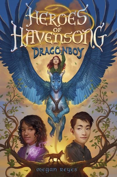
This week I began to read Heroes of Havensong: Dragon Boy (Book #1). The 4 main characters are portrayed on the cover. We see a blue dragon being ridden by a white female character. Below you see a mystic looking Black girl and a stoic Asian boy. The multicultural cast of characters is representative of today's push to have what Emily Style coined as windows, mirrors, and sliding glass doors in literature. This is the idea that a story can provide a reader a window into someone else’s experience, a sliding door to enter the story and become a part of the world and/or a mirror to reflect their own life experience. The creative choice to highlight the characters' race is telling of what is important to young readers. Even in a fantasy world they wish to connect with characters that look like themselves.

